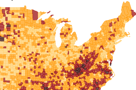
Slate Labs has an “interactive tool” to look at food deserts in the U.S. by county—places where a healthy variety of food is unavailable. They define a metric of desertification by counting the number of people who do not have access (not sure how this is defined) to a car AND live farther than one mile from a supermarket (not sure how this is defined, either). So, I went looking at some places I’ve lived.
My home county is Holmes County, Ohio. If you look at the map, it’s the one that’s an island of dark brown in the middle of Ohio. 27.91 percent of Holmes County is a food desert by this metric! Blame it on the Amish. Because the county is rural, there are few grocery stores. And, because the Amish do not have access to their own cars, they count a large portion of this population. Other counties with large Amish populations (relative to the non-Amish population) also stand out clearly.
It also appears that the map is distorted by population density, with sparsely populated areas being more prone to classification as food deserts. Is this fair? Is there anything that can be reasonably done about these areas even if they are food deserts? I don’t at all disagree that this is an important, significant problem, but it seems that there might have been a better metric. Perhaps it’s the most accessible metric with the available data?
Although this map may be revealing in many ways, it also distorts the reality a bit. For me, it’s a reminder to not consume “news infographics” too casually. I haven’t read all of the comments on the Slate piece and probably won’t. So, forgive me if someone has already noted some of the above. As a final note, most of the people who write for Slate are relatively ignorant of what happens in the part of the country between the Coast Ranges and the Appalachians. So, as one commenter wrote, it’s a “typical urbanite view” of food.
