Loyal readers know that from time to time, I am fortunate to travel to interesting and exotic locales for work—they usually come in pairs, so Greenland and Peru are it for a while. Although the motivation is usually field work, occasionally a conference pops up. The International Symposium on Equatorial Aeronomy occurs every three to four years and can be counted on for an exotic locale. Sarah had such a good time when we attended the 12th ISEA in Crete in 2008 that she insisted on attending the 13th in Peru with me this year. Of course, Evan complicated that a bit, and so we evaluated the pros and cons of leaving him with grandparents or bringing grandparents along, eventually finding a willing pair of grandparents to come along. If you’re interested in a general travelogue (and following posts) and some photographs, you might check out my father’s blogs. This short post is mostly focused on radio aspects of the adventure.
In retrospect, it may not have been such a good idea to bring ham gear to this meeting. Between being the most seasoned traveler in my family and the only one with a functional command of the Spanish language, plus Evan, plus hours of meetings and collaborations each day, there was little time/energy to actually operate. Getting to Peru was uneventful—we took an American Airlines codeshare flight on LAN Airlines via Miama to Lima and got there early in the morning. Unlike their neighbors to the south, Peruvian Customs is by far the most curious I’ve encountered while carrying radio gear—just a minor headache but Sarah was a bit concerned when they took me away for additional questioning. I carry modest gear—a Yaesu FT-840, Astron SS-30 (this should be replaced with something smaller, but it’s what I have), WKUSB, Palm Mini-Paddle, the K8GU portable antenna system, and various cables to connect it all up. After clearing Customs, we boarded a bus to Paracas, where the meeting would be held…

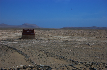
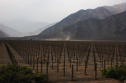
Paracas, which is about four hours’ drive south of Lima, was the site of a major earthquake several years prior and is still in recovery. The hotel that hosted the conference and a few nearby hotels had all been rebuilt from the ground up since the earthquake. The city is on a small bay that is protected from the Pacific. It’s very beautiful—desert sands that go right down to the bay. After a few days at the meeting, I managed to get the antenna set up.

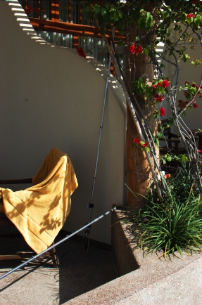
One of the things that surprised me was an excellent JA opening on 20 meters just after sunrise before I went to breakfast and then the meeting. I am pretty sure it was a direct-path opening because the signals did not sound like long path and the long path crosses the southern auroral oval, whereas the direct path does not. (Auroral absorption, by the way, is one reason that the long path can be more effective than the short path.) Any time I called CQ as OA5/K8GU, I was greeted with a roaring pileup. Not bad for an antenna propped up on my veranda. Verticals on the beach rule, and this one wasn’t even really on the beach.
At the request of a friend, I made a special effort to operate on 12-meter CW in the afternoon. The portable antenna would not tune up on 12 meters with the wire radials I had laid out. In a moment of desperation, I assembled some extra pieces of my portable antenna to produce a tuned radial that I clip-leaded to the ground lug as depicted in the photo above. It worked right away and I was quite popular there as well.
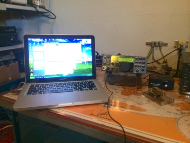
A comment about computers—my standard work-issued computer is a MacBook Pro, which although perfect for my work, is essentially useless for amateur radio. I know this will generate a torrent of discussion, but if you are accustomed to real contest/DXpedition logging software available for DOS and Windows, you know that the stuff for the Mac doesn’t cut the mustard. I have logged DX operations on paper (CE/K8GU), or in the case of the OX/K8GU operation, brought along a second computer. However, in a long-delayed flash of insight, I bought and installed VMware Fusion on the Mac in February. It runs Windows XP and TR4W with the WKUSB just brilliantly and with no special configuration. Aside from having to press Fn+F1 to CQ, this was an epic win. KB9UWU tells me that there’s an option in VMware to eliminate this nuisance as well.

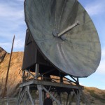
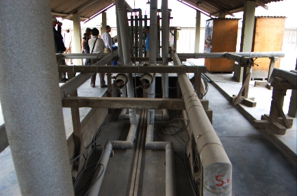
After the meeting in Paracas, we returned to Lima, where we celebrated the 50th anniversary of the Jicamarca Radio Observatory. The cornerstone of the Jicamarca facility is a 49.92-MHz radar that feeds an 18,720-element phased array, pictured above. Jicamarca is one of the most powerful radio transmitters in the world, capable of 4.5 MW output, and is used for a variety of atmospheric, ionospheric, and space science experiments. Like Arecibo, it was originally designed to perform incoherent scatter measurements of the ionospheric electron density profile.

Lots of fire in that wire! Have you ever seen a coaxial cable that’s rated for over a megawatt at 50 MHz? This is the feedpoint of the phased array. There are a few tuned stubs in there, too.

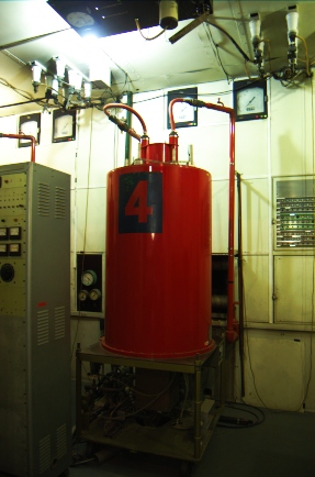
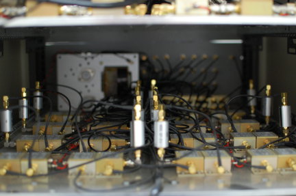
Here’s one of the four 1.5-MW transmitter cavities. A maximum of three are used together. When configured for three transmitters, the driver stage puts out 7 kW! Needless to say, everything is custom made on site. The transmitting tetrodes (8973s, if I recall correctly) are refurbished by the manufacturer as needed.
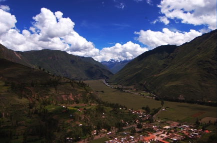
After Jicamarca, we went to Cusco, which is south and east of Paracas, and much more lush than the deserts around Lima and Paracas.

We spent a lot of time being tourists in Cusco and vicinity and I had some difficulty with my computer so I only made a handful of OA7/K8GU QSOs from Cusco on 17 meters. It is quite remarkable how much better the bands were from the coast. As someone who has operated from W3, W8, W9 and W0, I can attest to that difference as well. I missed my morning JA run…
A final thought—we drove through a lot of towns and communities in OA4, OA5, and OA7, on this trip. Nearly every town, no matter how small, had at least one building with an HF fan dipole on the roof. HF is alive and well in a mountainous country like Peru!
QSL information: If you worked OA5/K8GU or OA7/K8GU, the best way to get a confirmation is through ARRL’s Logbook of the World. I have been responding to direct cards (to my FCC address) with a one-day turn-around lately.
